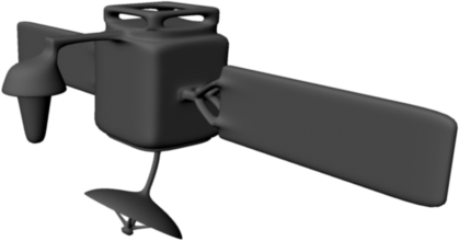
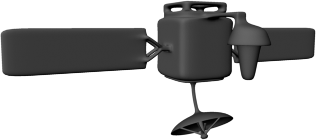
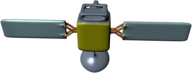
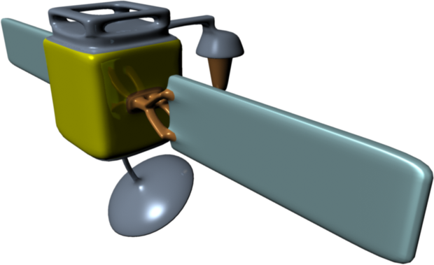
So I managed to finish my first satellite, but it looks really bad. The model its self looks really good in my opinion, but the shaders that I put on the model look horrible. In order to make it look good, I have to layout the UVs and use Photoshop to make the colors look descent, so I'll get to it sometime this week before Thursday.
Here are the renders for the model with out color:
Here are the renders for the model with color:
Today during class, the art team meet up with Roger to talk about where we were at in the art side of the game. We talked about the idea that we have about having two corporations in the game and Charlie said that he would be in charged of one corporation and I would be in charge of the other one. Brandon showed him the mock up of the HUD that he made and Roger told us to switch to a virtual HUD instead of the of what he made. Roger said that it would end up being a lot easier for everyone in the end.
Roger also told us that we have to focus on completely finishing at least one ship before we keep going.
Before I can start working on the art for one of the corporation, I have to go and fix the geometry of the ships that I made. Even if there isn't anything technically wrong with them, the geometry is a little messy. Brandon also said that I should probably try to round the edges of the ships since it might cause problems with the normal map technique we are trying to use to keep low poly models that look like high resolution models.
Thats all, thanks for reading.


No comments:
Post a Comment